Chemometrics & Statistics
02. Data Characterization 2Distributions
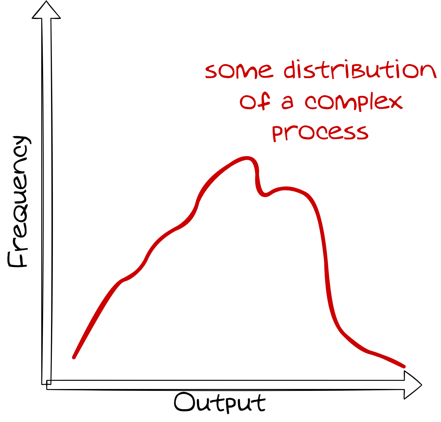
Distributions: Some Basics
When analyzing replicates of a sample, the results are often not identical.
The variability of the results can be described by a distribution.
The shape of the distribution is characterized by the process that generates the data.
Our task as chemometricians is to analyze and interpret these distributions.
Uniform Distribution
Let's start with the most simple distribution: the uniform distribution.
Imagine rolling a fair dice with 6 faces and 6 numbers (1, 2, 3, 4,
5, 6).
How are the individual numbers distributed?
Random Process & Combined Random Process
The uniform distribution is a single random process where each outcome has the
same probability.
However, most natural processes/systems are based on combinations of
multiple random processes
which lead to more complex distributions.
By modifying our dice experiment we can simulate such complex distributions.
before: roll 1000 dice
        individually
now: roll 30 dice at once,
consider the mean and
repeat this 1000 timesNormal Distribution
The normal distribution is the most important distribution in statistics.
It is characterized by a bell-shaped curve and is symmetric around the mean.
\[ f(x) = \frac{1}{\sigma \sqrt{2\pi}} e^{-\frac{1}{2} \left(\frac{x-\mu}{\sigma}\right)^2} \] \[ F(x) = \frac{1}{2} \left[1 + \text{erf}\left(\frac{x-\mu}{\sigma \sqrt{2}}\right)\right] \]
Where \(\mu\) is the mean, \(\sigma\) is the standard deviation, and \(\text{erf}\) is the error function.
PDF & CDF
The PDF (probability density function) describes the probability of a random variable falling
within a particular range of values.
The probability in a range is given by the area under the curve.
The CDF (cumulative distribution function) describes the probability that a random variable
will be found at a value less than or equal to a given value.
The CDF is the integral of the PDF. I.e., \[ \int_{x1}^{x2}PDF = CDF(x2) - CDF(x1) \]
Probability Calculations: Example
Let's assume we have a normal distribution with a mean of \(\mu = 0\) and a standard
deviation of \(\sigma = 1\).
What is the probability that a random variable will be found between -1 and 1?
We can calculate this by integrating the PDF between -1 and 1.
The Integral of the PDF is the CDF.
x1 = -1
cdf_x1 = 0.5 * (1 + erf(x1/sqrt(2)))
>> cdf_x1 = 0.15865525393145707x2 = 1
cdf_x2 = 0.5 * (1 + erf(x2/sqrt(2)))>> cdf_x2 = 0.8413447460685429
The probability that a random variable will be found between -1 and 1 is:
\(0.8413 -
0.1587 = 0.6826\).
t-Distribution: Definition
The t-distribution, also known as Student's t-distribution, is used in
statistics when the sample size is small, and the population standard deviation is unknown.
It is similar to the normal distribution, but with fatter tails.
The t-distribution approaches the normal distribution as the sample size increases.
The t-distribution is commonly used in hypothesis testing and in the construction of
confidence intervals.
Mean values from normally distributed populations are t-distributed.
t-Distribution: PDF & CDF
The t-distribution is defined by its probability density function (PDF).
\[ f(x) = \frac{\Gamma\left(\frac{v+1}{2}\right)}{\sqrt{v \pi} \Gamma\left(\frac{v}{2}\right)} \left(1 + \frac{x^2}{v}\right)^{-\frac{v+1}{2}} \]
Where \(\Gamma\) is the Gamma function and \(v\) is the degrees of freedom.
The cumulative distribution function (CDF) of the t-distribution.
\[ F(x) = 1 - \frac{1}{2} I_{\frac{v}{v + x^2}}\left(\frac{v}{2}, \frac{1}{2}\right) \]
Where \(I\) is the regularized incomplete Beta function and \(v\) is the degrees of freedom.
Fortunately, we don't have to calculate these functions by hand :)
Chi-Square Distribution: Definition
The Chi-Square (χ²) distribution describes the distribution of the sum of squared standard
normal variables.
It is widely used in hypothesis testing, especially in testing the variance of a normally distributed population.
The Chi-Square distribution has one parameter, degrees of freedom (df), which corresponds to
the number of independent random variables being squared and summed.
Sample variances from normally distributed populations are Chi-Square distributed.
Chi-Square Distribution: PDF & CDF
The probability density function (PDF) of the Chi-Square distribution is:
\[ f(x, k) = \frac{x^{(k/2 - 1)} e^{-x/2}}{2^{k/2} \Gamma(k/2)} \]
Where \(k\) is the degrees of freedom and \(\Gamma\) is the Gamma function.
The cumulative distribution function (CDF) of the Chi-Square distribution is:
\[ F(x, k) = \frac{\gamma(k/2, x/2)}{\Gamma(k/2)} \]
Where \(\gamma\) is the lower incomplete Gamma function and \(k\) is the degrees of freedom.
F-Distribution: Interactive Example
The F-distribution arises when comparing two variances by their ratio and depends on two
parameters:
degrees of freedom \(d_1\) and \(d_2\).
By adjusting the degrees of freedom, you can observe how the shape of the F-distribution changes.
As \(d_1\) and \(d_2\) increase, the F-distribution approaches a normal distribution.
F-Distribution: PDF & CDF
The F-distribution is defined by its probability density function (PDF).
\[ f(x) = \frac{\left( \frac{d_1}{d_2} \right)^{\frac{d_1}{2}} x^{\frac{d_1}{2} - 1}}{B\left(\frac{d_1}{2}, \frac{d_2}{2}\right) \left(1 + \frac{d_1}{d_2}x\right)^{\frac{d_1 + d_2}{2}}} \]
Where \(d_1\) and \(d_2\) are the degrees of freedom and \(B\) is the Beta function.
The cumulative distribution function (CDF) of the F-distribution.
\[ F(x) = I_{\frac{d_1 x}{d_1 x + d_2}}\left(\frac{d_1}{2}, \frac{d_2}{2}\right) \]
Where \(I\) is the regularized incomplete Beta function and \(d_1\), \(d_2\) are the degrees of freedom.
Emiprical Description of Data
x = [47.59, 50.96, 49.92, 51.93, 49.10,
     51.17, 49.68, 48.56, 51.79, 48.61,
     52.00, 47.58, 46.41, 48.78, 49.45,
     50.31, 49.58, 52.12, 53.82, 47.04,
     48.99, 49.70, 51.22, 52.76, 50.94,
     54.60, 48.35, 48.85, 47.53, 54.80,
     49.79, 50.25, 49.02, 49.86, 49.09,
     55.77, 49.76, 48.25, 45.15, 52.60,
     46.88, 51.95, 58.10, 52.41, 46.71,
     49.47, 48.73, 49.01, 46.67]
We have recorded some data. After processing, we obtained the results shown on the left.
What are the characteristics of this data?
How many data points were recorded?
What is the range of the data?
How does the distribution look like?
Are there any outliers?
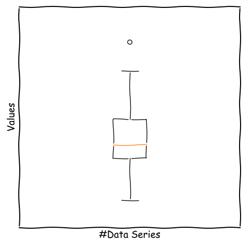
Whisker Boxplot
A very powerful tool for data characterization is the Whisker Boxplot.
The data series is shown as a box with two range indicators.
We obtain information about:
Median
Symmetry
Range
Outlier Candidates
How to Construct a Whisker Boxplot?
The first step will be sorting your data.
We divide the sorted data into four groups with mostly equal number of members.
Between these four groups, there are three edges (called quartiles: Q1, Q2, Q3).
Q1 Splits the data into 25% lowest and 75% highest values.
Q2 Splits the data into 50% lowest and 50% highest values.
Q3 Splits the data into 75% lowest and 25% highest values.
x = [45.15, 46.41, 46.67, 46.71, 46.88,
		 47.04, 47.53, 47.58, 47.59, 48.25,
		 48.35, 48.56, 48.61, 48.73, 48.78,
		 48.85, 48.99, 49.01, 49.02, 49.09,
		 49.10, 49.45, 49.47, 49.58, 49.68,
		 49.70, 49.76, 49.79, 49.86, 49.92,
		 50.25, 50.31, 50.94, 50.96, 51.17,
		 51.22, 51.79, 51.93, 51.95, 52.00,
		 52.12, 52.41, 52.60, 52.76, 53.82,
		 54.60, 54.80, 55.77, 58.10]
We already know, how to calculate the quartiles from former lecture.
Construct the Box of the Boxplot
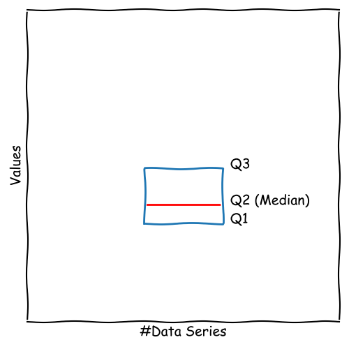
Having calculated Q1, Q2, and Q3, the box is defined, ranging from Q1 to Q3.
This length is called interquartile range (IQR).
50 % of the data points are located inside the box.
The median (Q2) is shown as a line inside the box.
The more the the median is shifted to the top or bottom, the more asymmetric the data is.
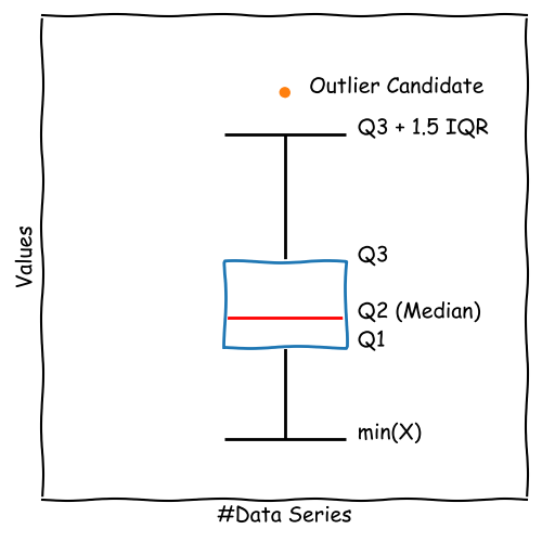
Construct the Fence of the Boxplot
To complete the boxplot, we need some information about the range of the data series compared to the IQR.
For this purpose, we add the fence to the boxplot describing the total range or a multiple (e.g. 1.5) of the IQR.
\[ \text{upper\_fence} =\\ \min \left( \max(x), Q3 + 1.5 \times IQR \right) \] \[ \text{lower\_fence} =\\ \max \left( \min(x), Q1 - 1.5 \times IQR \right) \]
Data outside the fence is plotted as individual points like
These points are considered as outliers.
Strengths and Limitations of the Boxplot
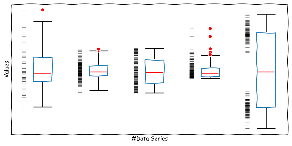
*note: the black horizontal dashes show individual data points and aren't part of a boxplot.
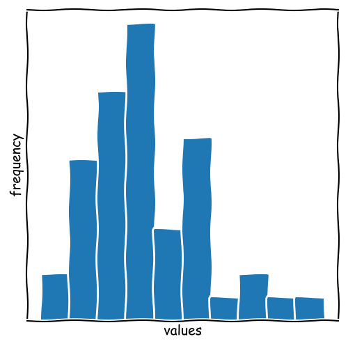
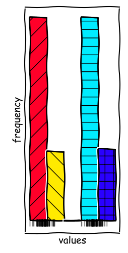
Histograms
Next to Boxplots, Histograms are nice tools for Data Characterization.
The data series is divided into several bins shown as bars.
Every bin covers a defined value range (mostly equidistant).
We obtain information about:
Mode
Distribution
Symmetry
Range
Construct a Histogram
x = [45.15, 46.41, 46.67, 46.71, 46.88,
47.04, 47.53, 47.58, 47.59, 48.25,
48.35, 48.56, 48.61, 48.73, 48.78,
48.85, 48.99, 49.01, 49.02, 49.09,
49.10, 49.45, 49.47, 49.58, 49.68,
49.70, 49.76, 49.79, 49.86, 49.92,
50.25, 50.31, 50.94, 50.96, 51.17,
51.22, 51.79, 51.93, 51.95, 52.00,
52.12, 52.41, 52.60, 52.76, 53.82,
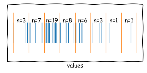
54.60, 54.80, 55.77, 58.10]The first step will be defining the bins.
To do so, we need the number of bins \(k\) or the bin width \(h\) first.
Here, we have serveral options; most common:
Sturges' Rule: \(k = 1 + \log_2(n)\)
Scott's Rule: \(h = \frac{3.5 \times \text{std}(x)}{n^{1/3}}\)
Freedman-Diaconis' Rule: \(h = 2 \times \text{IQR}(x) \times n^{-1/3}\)
Square-root Rule: \(k = \sqrt{n}\)
Manual: \(k = 5\)
... and many more.
Defining Bins and Their Edges
Depending on the rule, we obtain:
Sturges' Rule: \(k = 1 + \log_2(49) = 7\)
Square-root Rule: \(k = \sqrt{49} = 7\)
Scott's Rule: \(h = \frac{3.5 \times 2.57}{49^{1/3}} = 2.46\)
Freedman-Diaconis' Rule: \(h = 2 \times 3.2 \times 49^{-1/3} = 1.75\)
We can transform \(k\) into \(h\) and vice versa. \[ h = \frac{\max(x) - \min(x)}{k} \]
Rule:     k:  h:    (range: 12.95)
Sturges'  7   1.85
Square    7   1.85
Scott's   6   2.46
Freedman  8   1.75
Using \(\min(x)\), \(k\), and \(h\), we can define the edges of the bins.
\[ \text{edge}(i) = \min(x) + i \times h \]
Sturges  Square  Scotts  Freedman
= 45.1  	45.1    45.1    45.1
= 47.0 	  47.0    47.5    46.8
= 48.9  	48.9    49.9		48.5
= 50.8  	50.8    52.3		50.2
= 52.7  	52.7    54.7		51.9
= 54.6  	54.6    57.1		53.6
= 56.5  	56.5    59.5		55.3
= 58.4  	58.4            57.0
=                         58.7
The bin centers are located between the edges.
Assigning Data to Bins
After calculating the bin edges and centers, we can now count the data between two adjacent bins.
The number of data points within two edges represents the frequency and the height of the bar in the histogram.
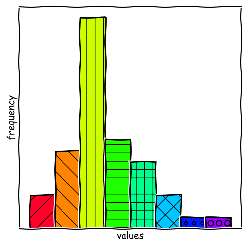
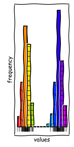
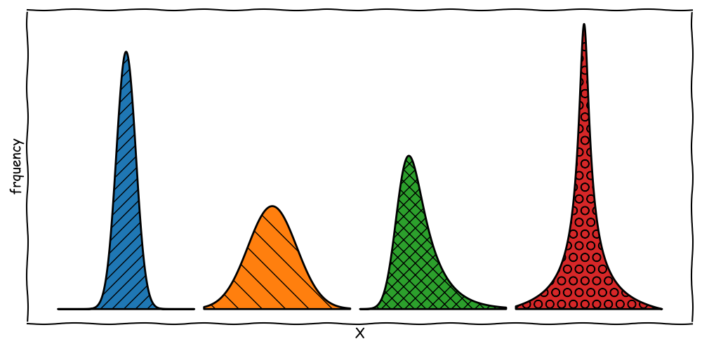
Strengths and Limitations of Histograms
Binning Rules Matter
In the example given, we can observe two local modes in the data series. With more bins, we can resolve these modes and get a better understanding of the data.
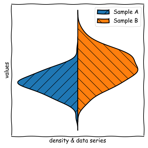
Kernel Density Estimation & Violin Plots
Kernel Density Estimation (KDE) is a non-parametric way to estimate the probability density
function of a random variable. It can be visualized as a Violin Plot.
We obtain information about:
Mode
Distribution
Symmetry
Range
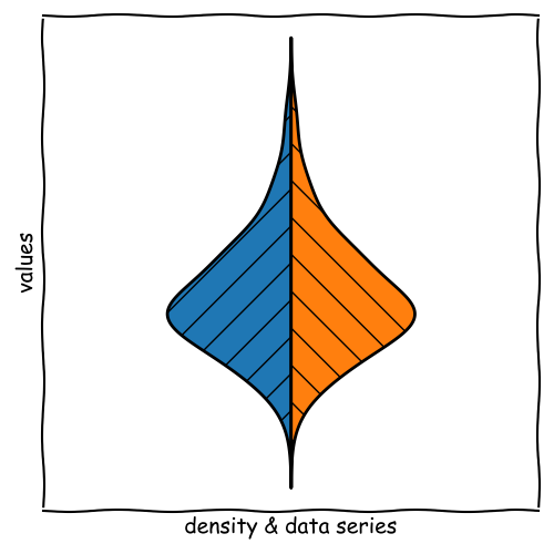
How does KDE work?
The main idea of KDE is considering each data point as a small distribution (e.g. Gaussian).
The distribution function that is used is called kernel.
The bandwidth of the kernel defines the width of the distribution. We can use rules similar
to bin width for histograms.
These distributions are summed up to get the overall probability density function.
For a violin plot, the kernel is mirrored and rotated by 90°.
Strengths and Limitations of KDE
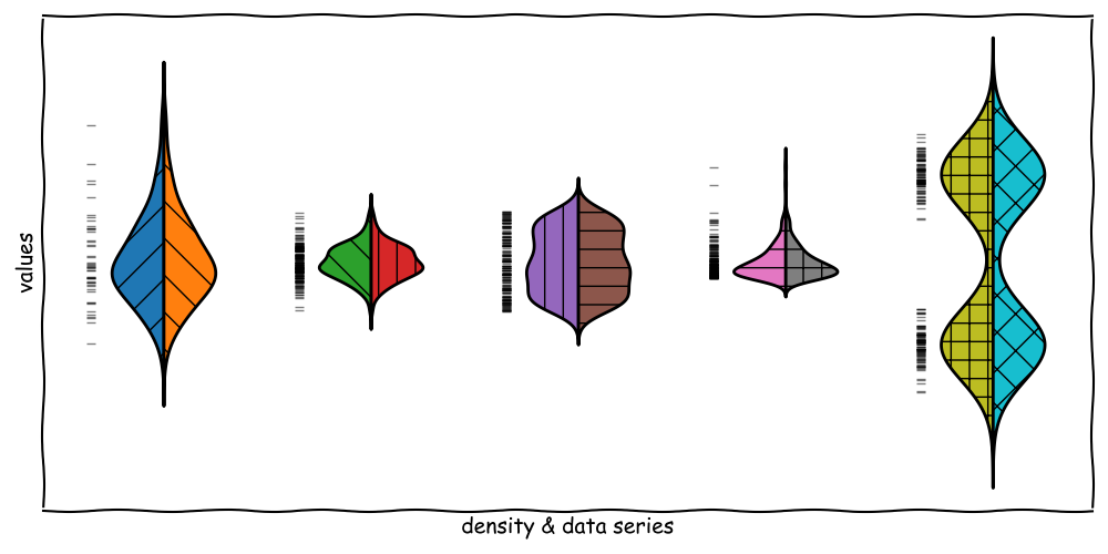
Violin Plots for Pairwise Comparison
Violin Plots are a great tool for pairwise comparison of data series.
To do so, we use one side for each data series and compare the shapes.
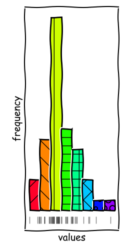
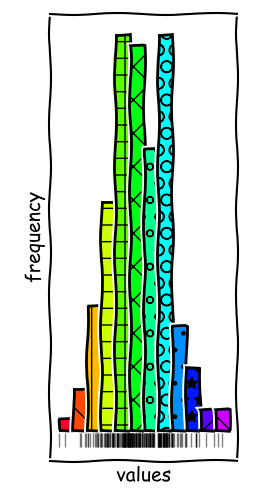
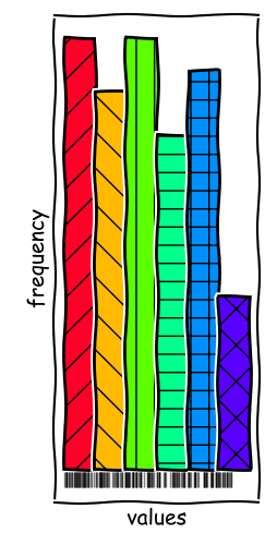
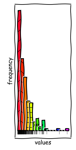
Moments of a Distribution
Describe the differences between the following distributions:
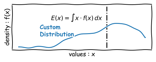
The Expected Value
The Expected Value of a random variable \(X\) is the theoretical average value considering
infinite repetitions or all possible outcomes of the population.
\[ E(X) = \mu = \sum_{i=1}^{n} x_i \cdot p(x_i) \] Where \(x_i\) are the values of the random variable and \(p(x_i)\) are the probabilities of the values.
The expected value is the first moment of a distribution.
Higher Moments & Central Moments
The Expected Value of a the kth power of a random variable \(X\) is called the
kth moment.
\[ m_k(X) = E(X^k) = \sum_{i=1}^{n} x_i^k \cdot p(x_i) \] Where \(x_i\) are the values of the random variable and \(p(x_i)\) are the probabilities of the values.
The expected value is the first moment of a distribution.
Instead ordinary moments, we often use central moments. The kth central moment is defined as:
\[ m_k^c = E\left(\left[X - E(X)\right]^k\right) \]
The second central moment is called variance and the
square root of the variance is called standard deviation.
The variance is a measure of the spread of the data and may also serves as a measure of the width of the distribution.
Normalized Central Moments: Skewness & Kurtosis
The normalized third central moment is called skewness. It is a measure of the asymmetry of
the distribution.
\[ m_3^{c,n} = E\left(\left[\frac{X - E(X)}{\sigma}\right]^3\right) \] Where \(\sigma\) is the standard deviation. The \(n\) in the superscript indicates the normalization.
For a symmetric distribution, the skewness is zero.
The normalized fourth central moment is called kurtosis. It is a measure of the roundness of
the distribution.
\[ m_4^{c,n} = E\left(\left[\frac{X - E(X)}{\sigma}\right]^4\right) \] Where \(\sigma\) is the standard deviation. The \(n\) in the superscript indicates the normalization.
For a normal distribution, the kurtosis is three. For a leptokurtic distribution, the kurtosis is greater than three.
Seminar Materials
You can download the seminar materials for this lecture here:
Create a Whisker Boxplot and a Histogram for the data series given in the file.
What are the characteristics of the data?
Are there any outlier Candidates?
How many bins would you choose for the histograms?
What are the expected values, variances, skewness, and kurtosis of the data series?